
Lesson 3: 基本的數學與簡單的統計量計算
Objective :
- 藉由不同的方式,計算幾個基本的敘述統計量(descriptive statistics),學習 Python 的基本數學計算技巧。
- 學習輸入外部的純文字資料檔(.txt 與 xlsx 檔)。
- 從網站下載 CSV 資料檔,供程式計算之用。
- 利用 Pandas 與 Scipy 套件處裡資料。
- 繪製基本散佈圖及其變化形式。
- 在散佈圖中加入多項式迴歸線。
- Python 的 Broadcasting 技術。
Prerequisite :
- 懂得基本的繪圖技巧,能控制座標區(axis)
- 熟練基本的 Python 語法
範例 1: Given ![x = [6\;\; 3 \;\; 5 \;\; 8 \;\; 7]](https://s0.wp.com/latex.php?latex=x+%3D+%5B6%5C%3B%5C%3B+3+%5C%3B%5C%3B+5+%5C%3B%5C%3B+8+%5C%3B%5C%3B+7%5D+&bg=ffffff&fg=333333&s=0&c=20201002)
![y = [2\;\; 4 \;\; 3 \;\; 7 \;\; 6]](https://s0.wp.com/latex.php?latex=y+%3D+%5B2%5C%3B%5C%3B+4+%5C%3B%5C%3B+3+%5C%3B%5C%3B+7+%5C%3B%5C%3B+6%5D+&bg=ffffff&fg=333333&s=0&c=20201002)


注意事項:
-
這個階段學習程式語言,不急著直接 copy/paste 現成的程式碼,而是先想想、試試該怎麼做?做不對了、想不出來了,再來一行行地看參考程式。也許看到某一行便能自己完成。
-
學習用不同的方式計算同一個統計量。藉此熟悉 Python 的各種語法與計算指令,譬如 np.sum(x)(object method) 與 x.sum()(module method)用法不同,意思一樣。
-
熟悉兩種將靜態文字與動態變數結合成一個字串的方式(以便利輸出觀看結果,或輸出到圖形的 title、legend …)
import numpy as np

x = np.array([6, 3, 5, 8, 7])
y = np.array([2, 4, 3, 7, 6])

sum_x_formula = x[0] + x[1] + x[2] + x[3] + x[4]
sum_x = x.sum() # numpy data's method

n = len(x) # sample size
x_bar_formula = sum_x / n
x_bar = x.mean()

var_x_formula_1 = ((x - x_bar)**2).sum() / (n-1) # element by element operation
var_x_formula_2 = np.sum((x - x_bar)**2) / (n-1)
var_x = x.var( ddof = 1) # ddof = 1: divided by N-1

std_x_formula = np.sqrt(var_x)
std_x = x.std( ddof = 1)

y_bar = y.mean()
std_y = y.std( ddof = 1)

print('The sample mean of x is {:.4f}'.format(x_bar))
print('The sample variation of x is {}'.format(var_x))
print('The sample standard deviation of x is %.6f' %std_x)
練習: Compute the zscore for the sample


注意事項:
-
要熟悉 Python 的數學計算語法,最好的方式是根據數學公式計算,再以現成的指令比對結果,譬如計算本範例的 Z score。現成的指令在 scipy.stats.zscore 。
-
下列程式碼刻意留一部分給讀者填補,否則學習程式容易變成觀賞別人的程式。就算看懂了,還是不會寫。
-
程式碼最後一行將依據公式計算的結果與現成指令比較。將兩筆向量合併列印。
-
讀者可以試著計算 skewness 與 kurtosis,分別從統計量的公式與 scipy 的指令(試著從 scipy 的官方網站查詢,當然也可以直接 google search 或 問 ChatGPT 找到範例程式碼)。
import numpy as np
from scipy.stats import zscore

x = np.array([6, 3, 5, 8, 7])
z = zscore(x, ddof = 1)
z_formula = .... do it yourself

# To compare two vectors
print(np.c_[z, z_formula]) # concatenate vertically
練習: Given


注意事項:
同樣是練習根據數學式計算統計量(相關係數)。
Scipy 提供計算相關係數的指令 pearsonr。最好上網查一下使用手冊,了解該指令的輸出為何物,才能正確拿到所要的值。譬如,這個指令輸出值超過一個,而第一個才是相關係數。
import numpy as np
from scipy.stats import pearsonr

x = np.array([6, 3, 5, 8, 7])
y = np.array([2, 4, 3, 7, 6])

# coding for r by formula
..............
r_formula = .....
print('Correlation coefficient by formula is {:.4f}'.format(r_formula))
# directly use command from scipy.stats
r_sci = pearsonr(x, y)[0] # the first return value
print('Correlation coefficient by scipy.stats.pearsonr is %.4f' %r_sci)
範例 2: 使用前面範例的 x, y 樣本,繪製 X-Y 散佈圖。
注意事項:
Python 有幾個繪圖的套件都支援散佈圖,本範例採 matplotlib 套件的 scatter 指令.
matplotlib 套件的 scatter 指令內容(attributes)非常豐富,請自行查手冊,玩玩其他功能,譬如每個點的形狀(marker),或點的大小(s=)、點的顏色(c=)。
畫散佈圖通常需要調整 X-Y 軸的範圍,讓散佈圖看得出散佈的趨勢。
import numpy as np
import matplotlib.pyplot as plt

x = np.array([6, 3, 5, 8, 7])
y = np.array([2, 4, 3, 7, 6])

size, color = 50, 'g'
plt.scatter(x, y, s = size, c = color)

# arrange axis range for better look
plt.axis([0, 10, 0,10])
plt.xlabel('x'), plt.ylabel('y')
plt.show()

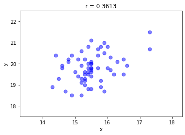
範例 3: 在程式中載入外部 TXT 資料檔案,並繪製資料的散佈圖及計算相關係數 $r$
注意事項:
請先下載示範的資料檔 demo_data.zip 。
一般而言,資料檔與程式檔放置在不同的目錄,在此假設資料檔與程式檔處在兩個平行的目錄,示範程式以相對路徑取得資料檔。
使用 Numpy 套件的 loadtxt 指令讀取 txt 檔,譬如,data1.txt. 請注意,指令 loadtxt 的參數(attribute) comments=’%’ 用來避免讀取檔案中被 % 註解的文字。讀者可以先打開 data1.txt 檔,看看裡面的內容。
在 Mac 電腦上常見 loadtxt 開啟時產生編碼問題(codec),此時可以加入一個 encoding 參數,指令改為 D = np.loadtxt(data_dir + ‘data1.txt’, comments=’%’, encoding=’iso-8859-1′)
程式示範了文字的串接,指引 loadtxt 指令正確的檔案位置。
loadtxt 指令的另一個重要的參數是 delimiter。用來區別資料檔內的行與行間的區隔,譬如,有些是逗號(’),或 TAB 間隔,或空白等。要能正確讀取 TXT 檔內的資料,最好先開啟檔案來看看。
下列的散佈圖的點顏色透過 alpha = 0.5 調整其透明度,適合資料量比較大的情況。不透明顏色顯得太沉重。
本範例計算相關係數時,直接採用 pearsonr 指令,而非自己寫計算式。因為我們已經在前面的示範程式證實,這個指令的結果便是我們要的相關係數。請注意,像 Python 這類的自由軟體所提供的指令,有些會與我們認知的有些許差距,必須透過手冊的確認或親自撰寫程式驗證,否則不能貿然取用。
import numpy as np
import matplotlib.pyplot as plt
from scipy.stats import pearsonr

data_dir = '../Data/'
D = np.loadtxt(data_dir + 'data1.txt', comments='%')
x, y = D[:, 0], D[:, 1]
r = pearsonr(x, y)[0]

plt.scatter(x, y, s = 50, c = 'b', alpha = 0.5)

plt.axis([x.min()-1, x.max()+1, y.min()-1, y.max()+1])
plt.title('r = %.4f' %r)
plt.xlabel('x'), plt.ylabel('y')
plt.show()
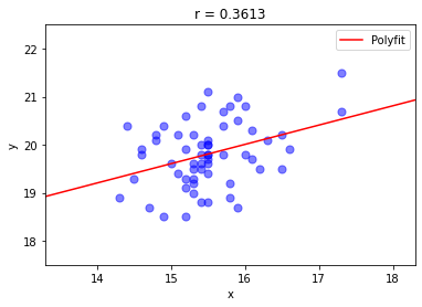
練習: 在前一個範例所呈現的散佈圖裡,畫一條線性函數的擬合線(fitted line)。
注意事項:
擬合的直線方程式可以從資料計算,在此先利用 Numpy 套件裡的指令 numpy.polynomial.polynomial.polyfit()(使用最小平方法擬合)直接得到直線方程式. 其回傳值含有方程式的係數。有了直線方程式的係數(最好先觀察一下係數的樣子),便能畫出直線。但必須親自做做看。
請試著接續前一個範例的程式碼,加入擬合直線的部分,畫出右下圖的擬合直線。
在上個範例下載的資料檔,有三個 TXT 檔,請分別畫出散佈圖與擬合線並計算其相關係數。
關於 polyfit() 的使用方式,譬如指定多項式的項次或其他功能,請查手冊。
學習者也可以試著從微積分或線性代數學到的最小平方法,去計算直線方式的係數。
from numpy.polynomial import polynomial

.... previous codes here

coef = polynomial.polyfit(x, y, 1)

.... add your codes below
....
範例 4: 從 EXCEL 檔案讀取著名的 Iris data 並繪製散佈圖與長條圖。
注意事項:
下載 iris.xlsx
學習使用 Pandas 套件處理 EXCEL 檔案,事半功倍。
Pandas 套件有許多內建的指令,能輕鬆的處理 EXCEL 工作表的資料,包括計算與繪圖。
使用不熟悉的套件時,可以透過 print 指令,將取得的資料列出來看。下列程式碼列印了三個內容,讀者一定仔細看看,才進行後面的計算與繪圖。
學習切割作圖區為矩陣式子圖 subplots,同時取得兩個子圖的座標區變數 ax1, ax2,以便能各別作圖。
因為切割成 (1,2) 子圖的關係,採用 super title suptitle 作為共同的 title。
練習將 iris.xlsx 工作表的第一與第二欄取出,並繪製散佈圖,且能利用欄位上的標題作為 X-Y 軸的標籤文字。
長條圖則採用 pandas 的附帶功能。在此先進行各欄資料的平均,再畫出平均數的長條圖。
import pandas as pd
import matplotlib.pyplot as plt

file_dir = '../Data/'
df = pd.read_excel(file_dir + 'Iris.xlsx', \
     index_col = None, header = 0)

print(df) # the contents
print(df.info()) # information for columns
print(df.describe()) # descriptive stats

fig, (ax1, ax2) = plt.subplots(
    1, 2, figsize=(8, 3))
ax1.scatter(df['Sepal Length'], df['Sepal Width'], \
     s = 150, c = 'r', alpha = 0.5)
ax1.set_xlabel(df.columns[0])
ax1.set_ylabel(df.columns[1])
fig.suptitle('The Iris Data') # the super title
df.mean().plot.bar(ax = ax2, ylabel = 'Mean Value')
plt.show()

練習: 模仿前面的範例,使用 pandas 套件,下載另一個 EXCEL 檔 TaiwanBank.xlsx,讀取資料並繪製如下的折線圖。
注意事項:
由於檔案從網路下載,因此可以直接讓 pandas.read_excel 讀取網址,示範指令如下一個參考範例的程式碼。建議讀者好好研究 pandas.read_excel 指令,了解他的能力,及可能的輸入參數與輸出的 data franme。
-
右下圖使用了中文的 legend,這需要做一些字型的宣告,如下程式碼所示範,其中的 font_path 必須依據所使用的電腦的字型路徑,請讀者自行查閱。
-
右下圖也對 X 軸刻度 x-tick 做了變化,請查閱手冊,試著完成。想學好程式,除了參考網路的資源外,也必須能獨立解決一些問題。下列的程式碼只是做些必要的提示,沒有完全揭露,但也不會完全沒線索。
import pandas as pd
import matplotlib.pyplot as plt
import matplotlib.font_manager as mfm

...
Read EXCEL file
draw the line chart and prepare for the legend
set and rotate the xtick
...

# the following codes will change the font of text shown on the axes
font_path = "C:\WINDOWS\FONTS\MSJHL.TTC" # 微軟正黑體
prop = mfm.FontProperties(fname = font_path)
plt.legend(prop = prop)

參考範例: The following codes are copied from the blog “Data Viz with Python and R” that demonstrates the power of Pandas and the advanced technique for the associated scatter plot.
Note:
Pandas can receive data from URL.
Pandas can take care of missing data (NA).
Matplotlib’s scatters data by its categories (associated with colors)
Demonstrate the legend for scatter plot.
Try to store data to an EXCEL file (pandas.to_excel)
import pandas as pd
import matplotlib.pyplot as plt

penguins_data="https://raw.githubusercontent.com/datavizpyr/data/master/palmer_penguin_species.tsv"
# load penguns data with Pandas read_csv
df = pd.read_csv(penguins_data, sep="\t")
df = df.dropna() # drop NA data (missing data)
print(df.head()) # print out the first few data

plt.figure(figsize=(8,6))
sp_names = ['Adelie', 'Gentoo', 'Chinstrap']
scatter = plt.scatter(df.culmen_length_mm, \
    df.culmen_depth_mm, alpha = 0.5, s = 150, \
        c = df.species.astype('category').cat.codes)
plt.xlabel("Culmen Length", size=14)
plt.ylabel("Culmen Depth", size=14)
# add legend to the plot with names
plt.legend(handles = scatter.legend_elements()[0],
           labels = sp_names,
           title = "species")
plt.show()

範例 5: Use the penguin_species data in the previous example. Calculate the means of culmen_length and culmen_depth, and their covariance matrix for each category (specie).
Note :
Learn how to extract desired data from a data frame to compute the required statistics, such as mean and covariance.
In the demonstration codes below, the mean pair of (culmen_length, culmen_depth) for each category are marked as ‘X’ on the scatter plot.
The covariance matrix of (culmen_length, culmen_depth) for each category is printed out.
Examine the covariance matrix and see whether the results are correct or not (check with the distribution for each category in the scatter plot)
import numpy as np
import pandas as pd
import matplotlib.pyplot as plt

... codes in previous example ...

# compute the means of the three categories
for sp in sp_names :
    cul_len = df.culmen_length_mm[df.species == sp]
    cul_dep = df.culmen_depth_mm[df.species == sp]
    plt.text(cul_len.mean(), cul_dep.mean(), 'X', color = 'r')
    X = np.stack((cul_len, cul_dep), axis = 0)
    cov = np.cov(X)
    print('The covariance matrix of {}\n'.format(sp), cov)
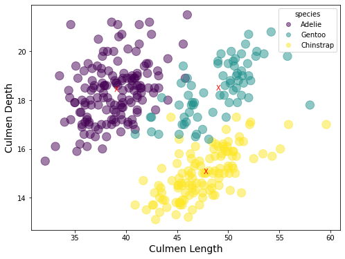
練習: The penguin_species data can be categorized by “species”, “island” and “sex”. Try to do the same things as in the previous examples, for example, draw the scatter plot, compute the means and covariance matrices for the category by “island” and by “sex”.
範例 6: 使用 Broadcasting 技術(向量計算)繪製

注意事項:這個問題展示了方波實由無數個圓滑波組合而成。讀者可以逐漸增加更高頻率的 
import numpy as np
import matplotlib.pyplot as plt

# The codes below demonstrate the ticks and labels in x axis
n = 100
x = np.linspace(-3 * np.pi, 3 * np.pi, 200)
y = 0
# Approach 1: by using for loop to add the terms
# for i in np.arange(n):
#     k = 2 * i + 1
#     y = y + np.sin(k * x) / k

# Approach 2:  by using the vectorized computation (broadcasting)
n = 100
k = 2 * np.arange(n) + 1
Y = np.sin(x.reshape(-1, 1) * k) / k
# Y = np.sin(k * x[:, np.newaxis]) / k
# print(x[:, np.newaxis].shape)

y = Y.sum(axis = 1) # sum along the row

fig, ax = plt.subplots(1)
ax.plot(x, y * 4 / np.pi, color = "r")
ax.set_xticks(np.array([-3, -2, -1, 0, 1, 2, 3]) * np.pi)
ax.set_xticklabels(
    ["-3$\pi$", "-2$\pi$", "$\pi$", "0", "$\pi$", "2$\pi$", "3$\pi$"],
    fontsize=10, color="b",
)
ax.set_ylim([-3, 3])
ax.grid(True)
ax.set_xlabel('x'),  ax.set_ylabel('f(x)')
ax.set_title('$f(x) = 4/\pi(\sin x+\sin 3x/3+\sin 5x/5 + \cdots)$')
plt.show()

範例 7:基本的 Broadcasting 技術。
利用計算圖一的標準常態 CDF 表來比較迴圈與 Broadcasting 在觀念與技術之不同。
注意事項:
遇到這類的問題,一般寫程式的邏輯會直接想到用「線形」流程的迴圈技術來解決。但 Python 卻擅長以「平面(矩陣)」的角度來看待問題(稱為 Broadcasting 廣播),不僅得到較為乾淨俐落的程式碼,其程式執行效率也提高不少。值得初學者留意並熟練之。其他語言如 R 與 MATLAB 也是如此。
下列利用 Broadcasting 程式碼(第 14 行)的 z_col.reshape(-1, 1) + z_row,這是一個便利的作法,因為第一項將原向量轉為「行向量」(nx1),而第二項仍維持原來不分行列的向量(m,)。當面對兩個不同大小的向量相加時,Python 會將不明確的一方(即第二項)轉為列向量(1,m),於是變為行向量(nx1)與列向量(1xm)相加。這在線性代數是不合法的加法,但是在 Python 卻方便地解讀為將行向量與列向量同時擴展為 nxm 矩陣,再進行相加。「擴展」的意思是複製,將行向量往又複製 m 行,將列向量往下複製 n 列。
下列示範的程式碼刻意將結果的輸出做不同的呈現。其中 Approach 2 將輸出書字的小數點位數固定為 4 位,讓整個輸出降為整齊。也就是將數字 0.5 改為文字 0.5000。
import numpy as np
from scipy.stats import norm

z_col = np.arange(0, 3.1, 0.1)
z_row = np.arange(0, 0.1, 0.01)
# Approach 1: use double loop
Z = np.zeros((len(z_col), len(z_row)))
for i in range(len(z_col)):
    for j in range(len(z_row)):
        Z[i, j] = norm.cdf(z_col[i] + z_row[j])
print(np.round(Z, 4))

# Approach 2: use broadcasting
Z = norm.cdf(z_col.reshape(-1, 1) + z_row) # reshape(-1, 1): column vector
M_str = np.array2string(np.round(Z, 4), formatter={'float_kind':lambda x: "%.4f" % x})
print(M_str)
圖一、標準常態的 CDF 查表
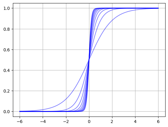
範例 8:基本的 Broadcasting 技術。
繪製函數
注意事項:
本範例的 Broadcasting 技術呈現在兩個向量相乘,其中一個是明確的行向量,另一個是不明確向量。此時相乘的效果等同是 nx1 的行向量乘以 1xm 的列向量,其結果是 n x m 的向量。
本範例同時展示將不同函數集中在一個矩陣 Y,同時繪製。讀者不難觀察出矩陣的每一行代表一個函數圖。
import numpy as np

x = np.linspace(-6, 6, 300)
alpha = np.arange(1, 11, 1)
Y = np.exp(x.reshape(-1, 1) * alpha) / (np.exp(x.reshape(-1, 1) * alpha) + 1)
plt.plot(x, Y, color = 'b', alpha = 0.5)
plt.grid(True)
plt.show()
習題:
練習迴圈與矩陣的運算
練習散佈圖的繪製
練習以線性代數的矩陣運算處理重複性計算。
練習將矩陣儲存到 EXCEL 檔案(含列與欄標題)。
以下共三題
1. 繪製下圖(線條顏色、符號與數量都可以由程式輕易變更)
注意事項:
將數量的決定放在 code 第一條,譬如,n = 6
將符號的決定放在 code 第二條,譬如,marker = ‘s’
不論畫同心圓或圓上方塊符號,可以採用迴圈方式或非迴圈的矩陣計算方式(Broadcasting 技術)。最好兩者都試試看(從自己最有把握的方法先做),才知道 python 的長處(可以先不論顏色)。
上述方式可以迅速變更設定,看到結果。

2. 繪製下圖一(線條顏色與數量都可以由程式輕易決定)
注意事項:
將方框數量的決定放在 code 第一條,譬如,n = 8,改變 n 值,便能看到結果的改變,譬如,n = 128 得到圖二。
接著將籃子的形狀稍作變更,使之更像真實的摩天輪,如圖三、圖四。
再則,可以製作成動畫,讓摩天輪動起來。此時可以加入兩個參數,分別決定順逆的方向與速度。
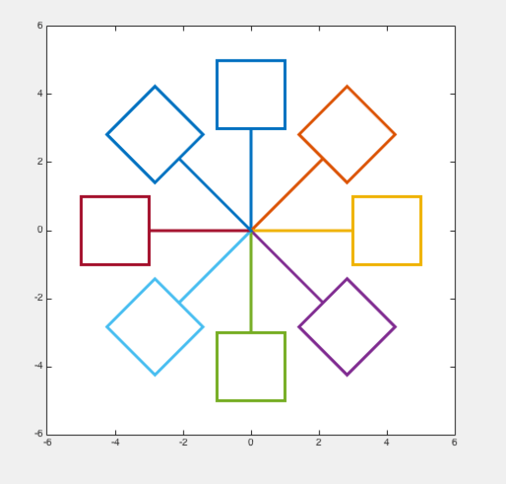
圖一、簡易北大摩天輪 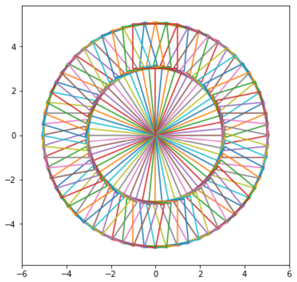
圖二、增加籃子的數量 
圖三、更接近真實的摩天輪(取自同學作品) 
圖四、更接近真實的摩天輪(取自李慧敏同學作品)
3. 計算如下右圖的卡方右尾面積與自由度對照表,並輸出到 EXCEL 檔,檔名為:Chi2Table.xlsx,含欄與列的名稱,如下左圖。
注意事項:
提示的套件與程式碼如下方 code 區所示。
利用 pandas 將矩陣內容儲存到 EXCEL 檔,製作方式請參考 pandas 手冊。
from scipy.stats import chi2

F = 0.995 # cumulative to 1
df = 1
x = chi2.ppf(F, df)  # inverse of CDF
print(x)


